Block Fit Manual
E d i t o r i a l
C H A L L E N G E
A comprehensive fitness manual was developed from an eleven-page source document containing poorly organized content with little established hierarchy or structure. The challenge was to transform the material into a clear, engaging publication for both print and digital use, while retaining all required content and creating a logical experience for the reader.
The final manual also needed to function as a saddle-stitched publication, incorporate data visualization and interactive elements, and meet accessibility and press-ready production requirements.
I N S I G H T
Rather than following the structure of the source document, the content was reorganized around the reader’s journey toward better health. Early planning and page sketches helped establish the information architecture, grouping related content and identifying opportunities to bridge sections with additional material.
A six-stage roadmap — Set Goals, Exercise Fundamentals, Know Your Body, Fuel Your Body, Personalized Training and Achieve Results — became the organizing framework for the manual, giving readers a clear progression through the information.
s o l u t i o n
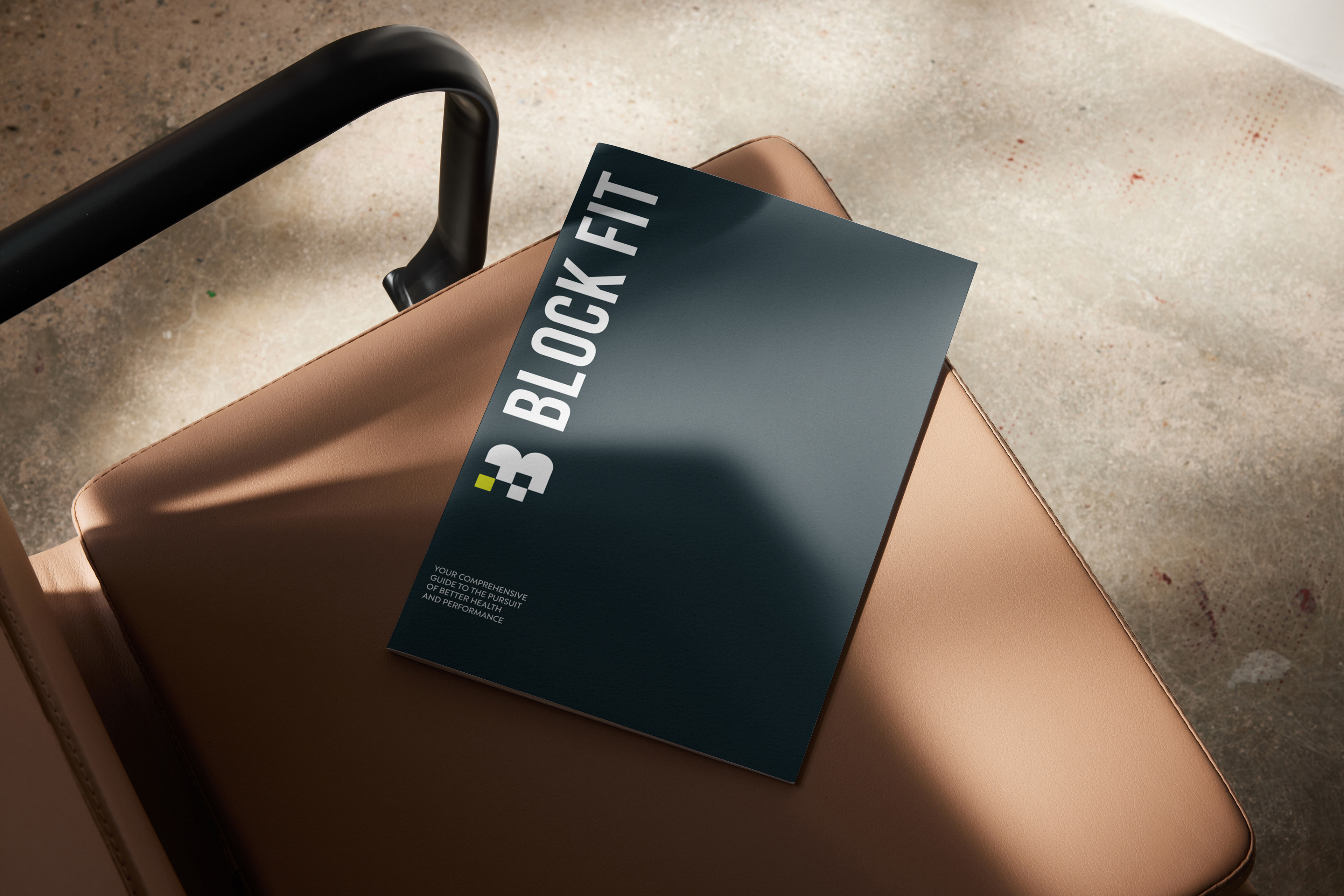
A complete visual identity was developed for Block Fit, including the name, logo, colour palette, typography and supporting graphic system. The modular B mark informed the use of blocks throughout the publication, creating a flexible visual language for section navigation, content hierarchy and page composition.
A high-contrast palette of midnight teal, pale pink, powder blue and neon yellow, gives the manual an energetic, contemporary fitness aesthetic while helping key information, calls to action and navigational elements stand out.
R E S U L T S
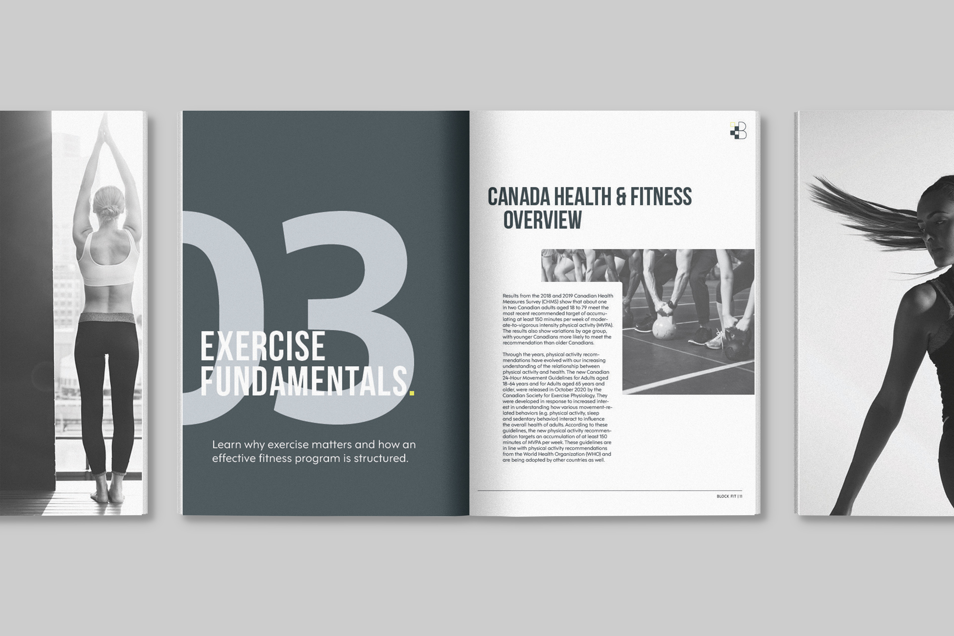
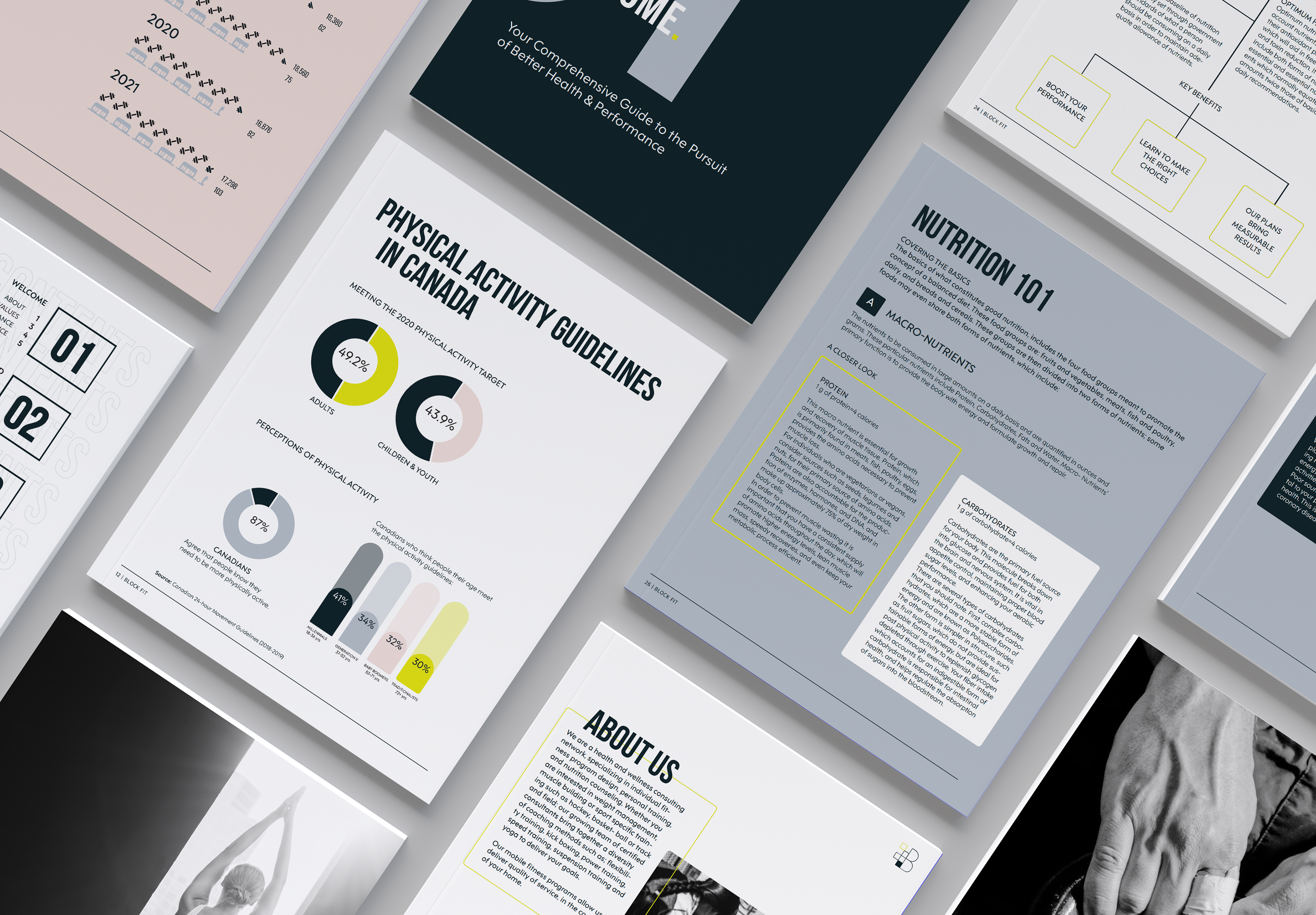
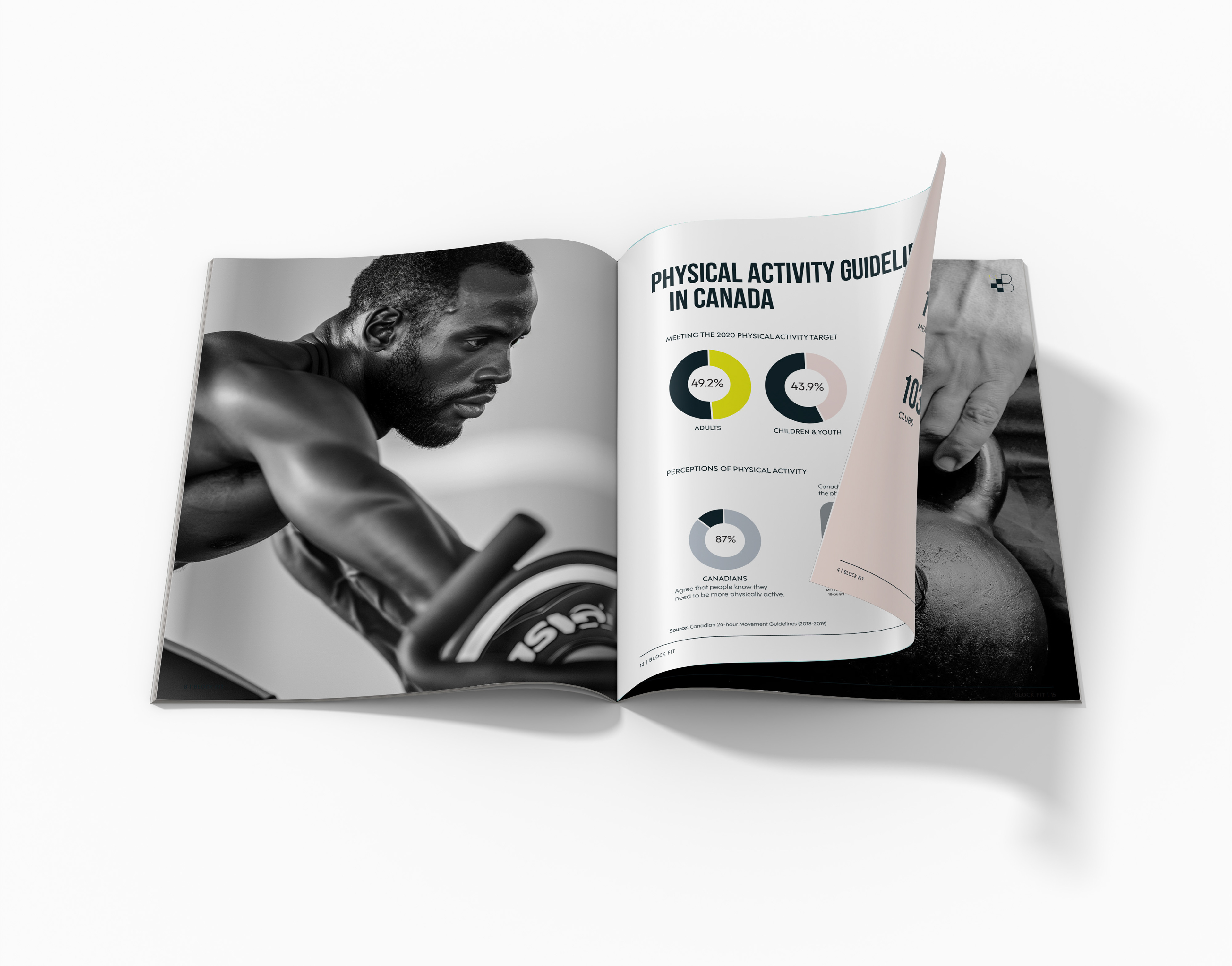
The original eleven-page document was expanded into a 36-page editorial system, using a consistent grid, section openers, photography, pull quotes, diagrams and varied page structures to break dense information into more approachable pieces.
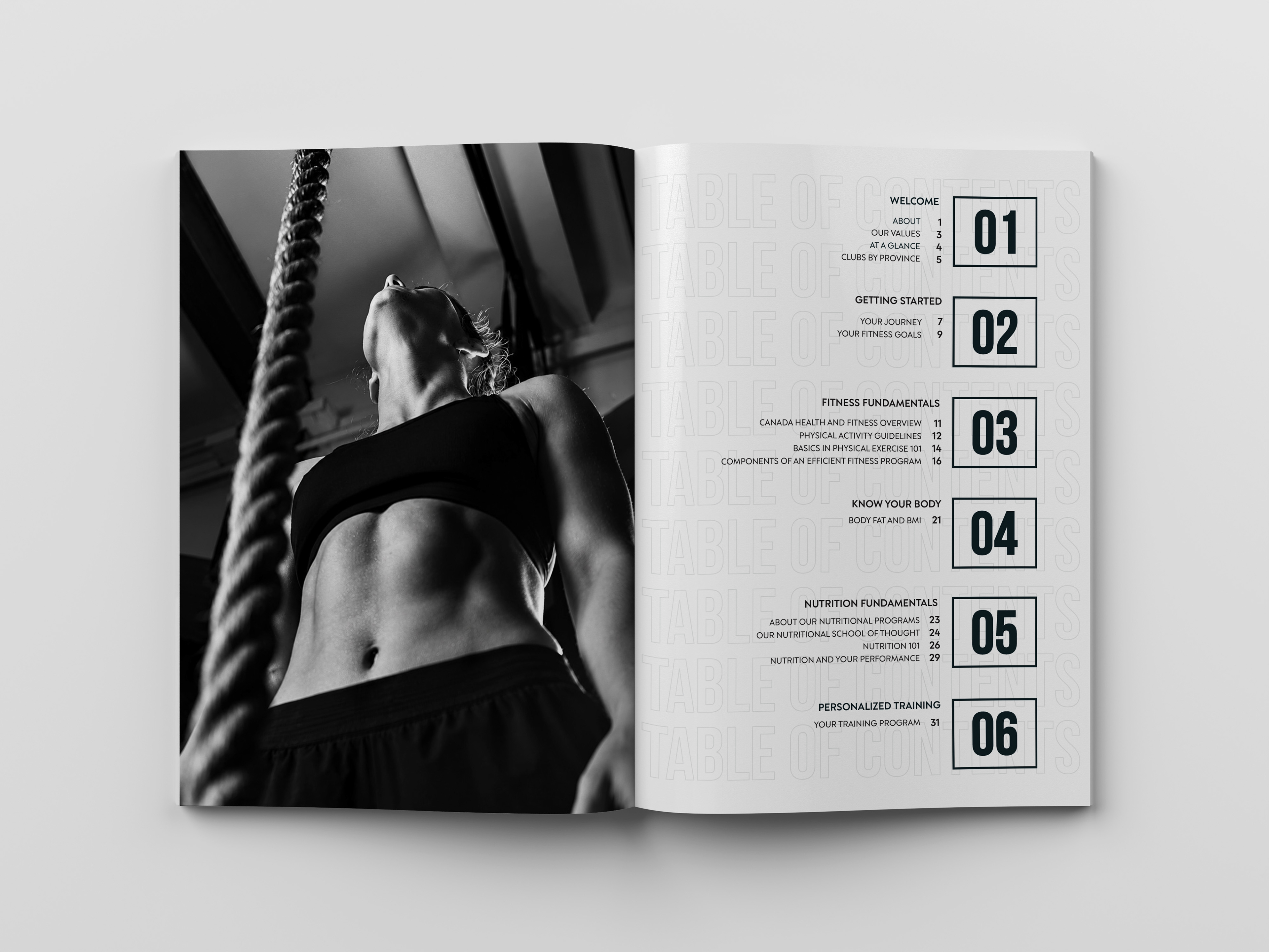
Four data visualizations were developed to translate statistics and comparative information into more immediate visual forms, while a dynamic table of contents and recurring navigational elements help readers move through the publication.
The 36-page format was planned specifically for saddle-stitch production, with appropriate margins, bleeds and print specifications incorporated into the press-ready files. A separate interactive and accessible PDF extended the print experience digitally, incorporating navigation and at least five animated elements.