Foxtail Bistro
B r a n d i d e n t i t y
C H A L L E N G E
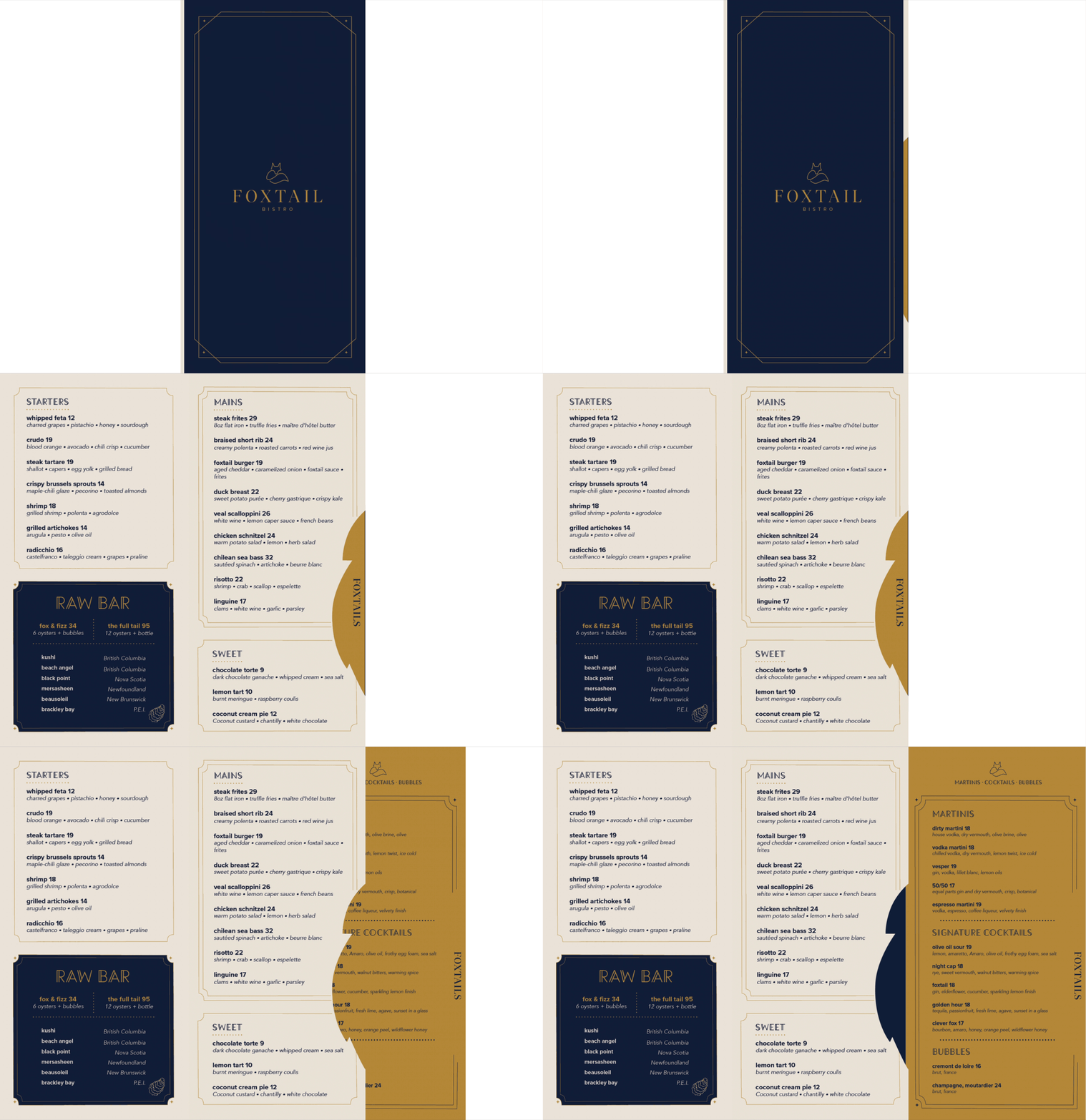
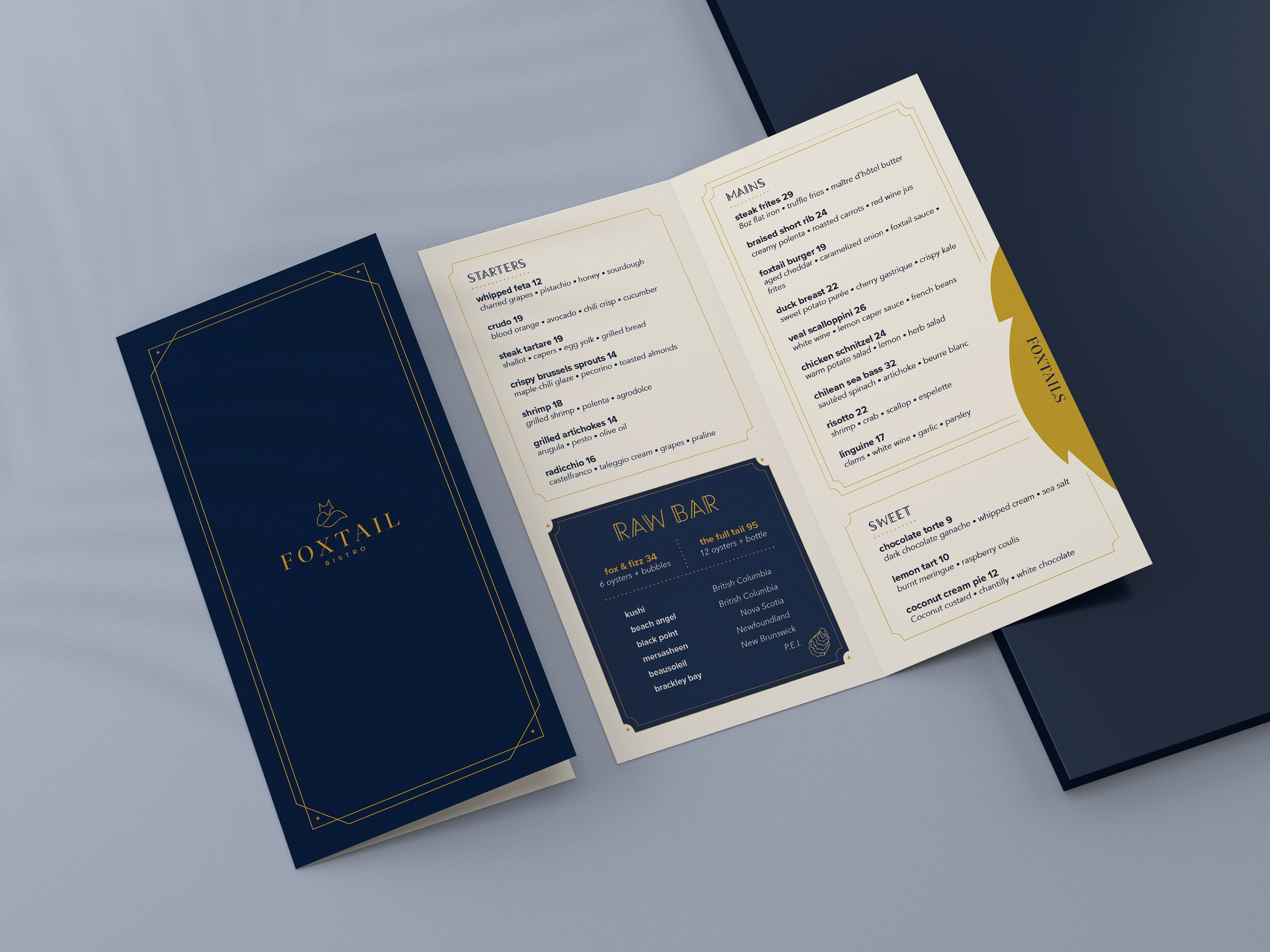
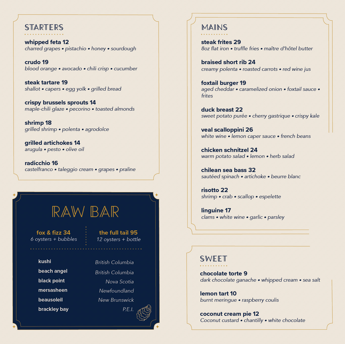
A brand identity and menu system was developed for Foxtail Bistro, a new neighbourhood restaurant designed to feel elevated yet familiar and approachable. The dining experience is somewhere you could come in for oysters and bubbles at the bar, or stay for dinner and cocktails. The menu incorporates a unique fold, die cut and gold foil specialty finish.
I N S I G H T
The visual direction grew from the idea of making a new restaurant feel as though it had already become part of the neighbourhood. Deep navy brings a sense of familiarity, trust and permanence, while gold adds warmth and a touch of glamour, giving the identity a more elevated sense of occasion.
The fox became a natural symbol for the brand: sleek, clever and a little sly, capturing the balance between polished dining and a more casual, playful bar culture. Art Deco-inspired typography and geometric linework add character and a subtle sense of history and craftsmanship.
S O L U T I O N
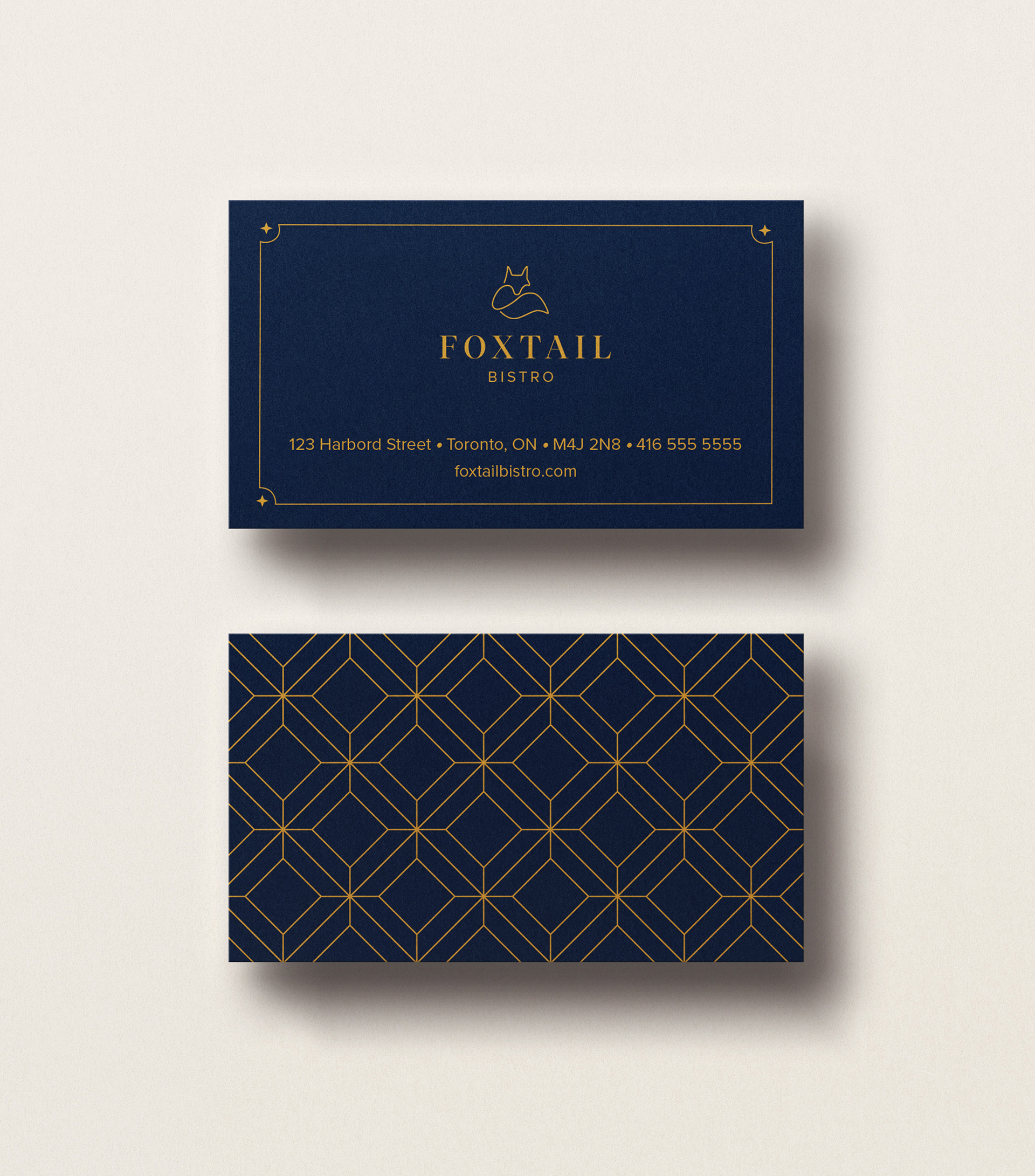
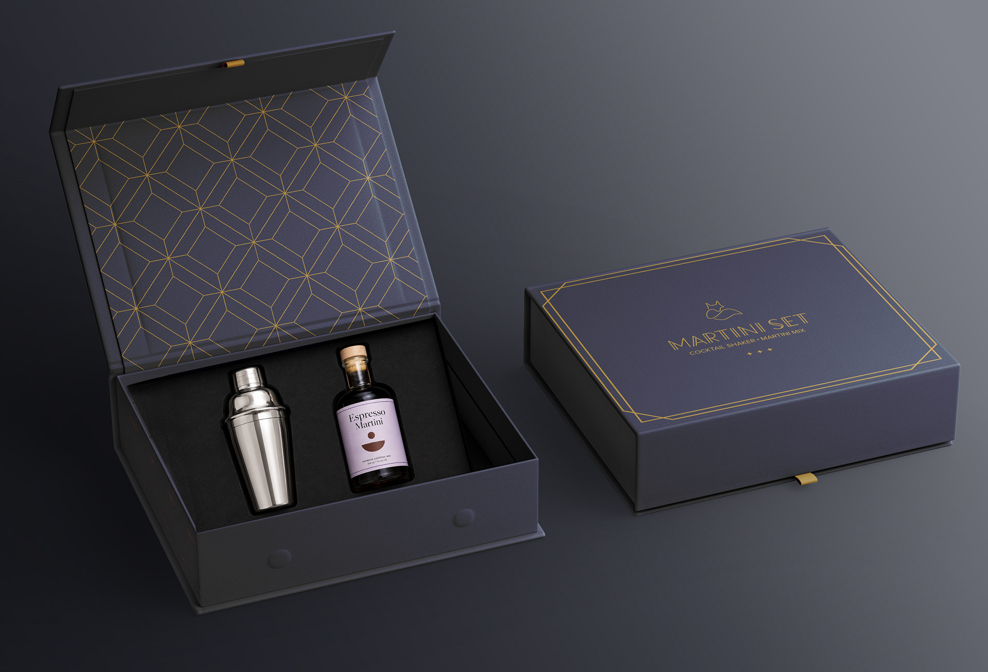
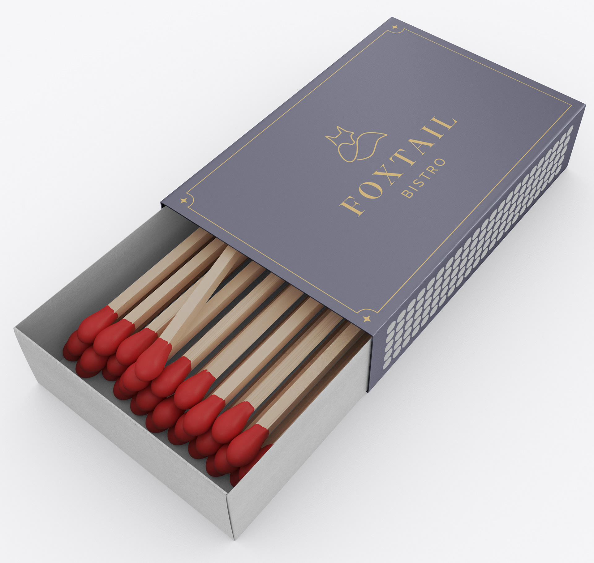
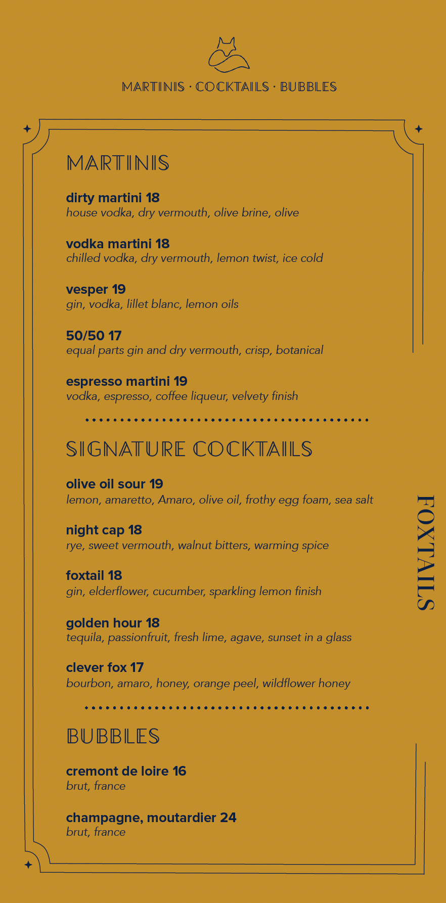
The identity was carried across a folded menu, business card and branded collateral using the navy-and-gold palette and minimal fox mark. A playful die-cut opening reveals a removable Foxtails cocktail menu, giving the drinks program its own moment while adding an element of discovery. The interaction plays into the tension at the heart of the brand—refined dining balanced by neighbourhood approachability.
R E S U L T S
The final identity gives a new restaurant the familiarity of an established neighbourhood spot with the energy of somewhere you want to stay for another drink. Refined and playful elements work together to create a brand that feels distinctive, inviting and built for both dinner and drinks nightlife.